Learning color psychology design is one of the most rewarding ways to grow as a creative, whether you are starting fresh or building on skills you already have. This guide walks through the ideas, tools, and practice habits that make color psychology design approachable, enjoyable, and genuinely useful in real projects.
You do not need expensive tools or years of training to begin. What you need is a clear starting point, a few simple exercises, and a habit of studying work you admire. A good companion topic is color theory for beginners, which builds related creative judgment you will use here.
By the end of this guide, you will understand how color psychology design works, which tools suit it best, and how to practice in short sessions that fit a busy week. You will also find related ideas, such as graphic design tips for beginners, to explore once the basics feel comfortable.
What Is Color Psychology Design?
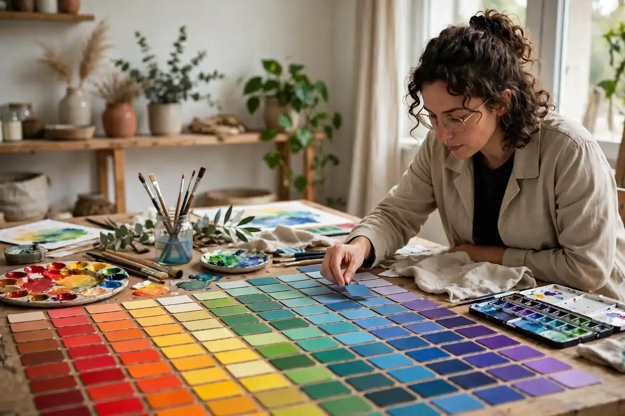
Color speaks before words do. A warm red can feel urgent or appetizing, a deep blue can feel calm or corporate, and those reactions shape how people judge a brand, a room, or a poster.
Color meanings are not fixed rules, however. Culture, context, and combination change them, so thoughtful designers test palettes with real audiences instead of following color charts blindly.
That is why color psychology design suits creators at every level. Beginners gain a structured way to practice, while experienced creators use it to sharpen judgment, try new approaches, or break out of a creative rut. The key is to start simple, work steadily, and judge progress over weeks rather than single sessions.
Tools and Materials for Color Psychology Design
You can begin color psychology design with a small, affordable kit. The list below covers the essentials; add specialty items only after you know which parts of the process you enjoy most.
- A color wheel or digital palette tool
- A mood board for the feeling you want
- Accessibility contrast checker
- A palette of three to five tested colors
- Examples of palettes from brands you admire
Keep your kit and files organized in one place so practice feels easy to start. When setup takes only a minute, you are far more likely to create every day.
Core Color Psychology Design Methods
The core of color psychology design comes down to a handful of methods. Practice each one separately first, then combine them in finished pieces. A related guide worth reading alongside this section is sketching for beginners.
Warm colors
Reds, oranges, and yellows tend to feel energetic, warm, and attention-grabbing. Use them for calls to action, food, and celebration, but sparingly, since too much warmth feels loud.
When you practice warm colors, try it on a small test piece before using it in a finished project. Notice how small choices change the result, and keep the test beside you as a reference. Small, deliberate experiments like this build confidence faster than rushing into a large piece and hoping it works out.
Cool colors
Blues, greens, and purples often feel calm, trustworthy, or luxurious. They suit health, finance, and technology contexts where steadiness matters.
When you practice cool colors, try it on a small test piece before using it in a finished project. Notice how small choices change the result, and keep the test beside you as a reference. Small, deliberate experiments like this build confidence faster than rushing into a large piece and hoping it works out.
Neutrals and balance
Neutrals give bold colors room to work. A palette built mostly on neutrals with one strong accent usually feels more sophisticated than five competing brights.
When you practice neutrals and balance, try it on a small test piece before using it in a finished project. Notice how small choices change the result, and keep the test beside you as a reference. Small, deliberate experiments like this build confidence faster than rushing into a large piece and hoping it works out.
Culture and context
Color meanings vary across cultures and settings. Research your audience and test palettes, especially for global products or sensitive topics.
When you practice culture and context, try it on a small test piece before using it in a finished project. Notice how small choices change the result, and keep the test beside you as a reference. Small, deliberate experiments like this build confidence faster than rushing into a large piece and hoping it works out.
Color Psychology Design Step by Step
Follow this workflow for your first few finished pieces. Once the steps feel familiar, adapt the order to suit your own habits.
- Define the feeling and action you want the design to create.
- Build a small palette with a lead color and supporting tones.
- Test the palette on real layouts, not just swatches.
- Check contrast for readability and accessibility.
- Apply the palette consistently and note the color codes.
After your first attempt, compare the result with your goal and note one improvement for next time. That single note is often more valuable than a long list of corrections, and it keeps practice focused. For broader creative foundations, charcoal drawing techniques is a helpful next read.
Common Color Psychology Design Mistakes to Avoid
Every creator makes the same handful of mistakes when learning a new method. Knowing them in advance helps you spot them early, while they are still easy to fix.
- Choosing colors from personal taste alone.
- Using too many bold colors at once.
- Ignoring contrast, which harms readability.
- Assuming one color always means the same thing everywhere.
If a project goes wrong, treat it as information rather than failure. Save it, note what happened, and try again with one change. Creators who learn this way improve steadily, and guides such as mixed media art for beginners show how the same patient approach works in other media.
A Simple Color Psychology Design Practice Plan
A simple weekly plan works better than occasional long sessions. Try three short sessions of twenty to thirty minutes, each focused on one skill: one for study, one for technique, and one for a finished piece. Short sessions keep your attention sharp.
Keep a practice folder separate from finished work, and date your files. Looking back over a month of dated practice is one of the best motivators, because progress that feels invisible day by day becomes obvious across weeks. If you enjoy structured practice, botanical illustration for beginners pairs naturally with this routine.
Share your work occasionally, even if it feels unfinished. Feedback from other creators, a local class, or an online community often highlights strengths you overlooked and suggests the next skill worth practicing.
Tips for Better Color Psychology Design Results
These tips help you get more from every session, whether you are working at a desk, outdoors, or in a classroom.
- Test palettes in grayscale to check value contrast.
- Let one color dominate and others support.
- Keep a palette document with exact codes.
- Revisit color choices when the audience or market changes.
Frequently Asked Questions About Color Psychology Design
How long does it take to learn color psychology design?
Most beginners notice real improvement within a few weeks of regular practice, though mastery takes much longer and that is perfectly normal. Focus on steady progress rather than speed: a few short sessions each week will teach you more than one long, exhausting session.
What tools do I need to start color psychology design?
You need only basic, affordable tools to begin color psychology design, and the list earlier in this guide covers them. Start simple, learn what you enjoy, and add specialty supplies gradually as your skills develop. Expensive tools never replace practice, so invest your time first and your money second.
Can beginners try color psychology design?
Yes, color psychology design is well suited to beginners, because the basic ideas are simple even though skilled work takes practice. Start with easy projects, follow the step-by-step workflow in this guide, and accept imperfect early results as part of learning.
How often should I practice color psychology design?
Three short sessions a week is a realistic and effective rhythm for most people learning color psychology design. Short, focused practice keeps your skills fresh without turning creativity into a chore. If you miss a week, simply return to the next session without guilt.
Related Design Guides
Keep exploring with ink drawing techniques for beginners, perspective drawing basics, bedroom wall art ideas, living room makeover ideas, figure drawing for beginners, still life drawing for beginners, how to sell art online. Each of these guides builds a skill that complements color psychology design, and working through them in any order will broaden your creative toolkit.
Final Thoughts on Color Psychology Design
Color Psychology Design rewards patience, observation, and regular practice more than talent or expensive tools. Start with simple projects, practice the core methods one at a time, and let your skills grow through short, enjoyable sessions. Your next project will be better than your last, and the one after that better still.
If you are ready to begin color psychology design, choose one small project for this week and finish it completely, even if it feels imperfect. A finished small project teaches more than an ambitious one left half done, and it gives you a real piece to learn from. Then pick the next skill from this guide, practice it in a short session, and keep building one finished piece at a time.