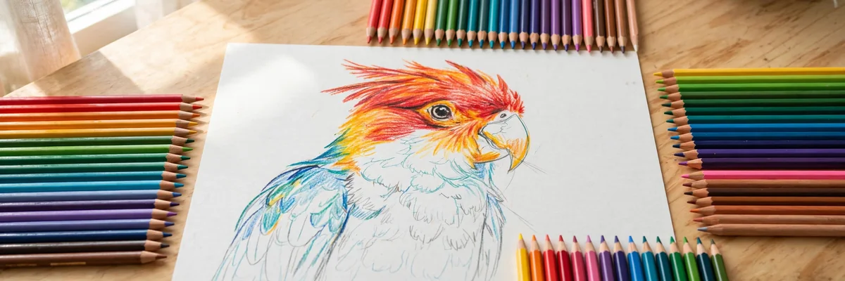
Colored pencils are the most underestimated art supply in America. Most people remember them as children’s tools, yet professional colored pencil artists create photorealistic portraits, luminous botanical illustrations, and gallery-worthy landscapes with nothing but wax, pigment, and paper. The secret is that colored pencil drawing is not coloring — it is painting with dry pigment, built in transparent layers exactly like watercolor or oil glazing. This guide teaches you the real techniques: layering, burnishing, color theory for pencils, the paper and pencil brands that matter, and a step-by-step project that takes you from a blank page to a finished piece you will want to frame.
Colored Pencil Drawing Basics: Why Layering Beats Pressing Hard
The number one beginner mistake in colored pencil drawing is pressing hard to get rich color immediately. Heavy pressure crushes the paper’s tooth — the tiny texture that holds pigment — and leaves you with a waxy, streaky surface that cannot accept more layers. Professionals do the opposite: they build color in many light layers, letting each one settle into the tooth before adding the next. Ten light layers of crimson produce a deeper, more luminous red than one heavy scribble ever could.
Think of each layer as a glaze. Your first pass might be a pale yellow laid down with the lightest touch; the second, a soft orange over it; the third, a whisper of red in the shadows. Viewed together, the layers optically mix into a glowing amber that no single pencil could produce alone. This is the same optical-mixing principle behind great acrylic painting techniques for beginners — transparent layers creating depth that opaque application cannot match.
Patience is the medium’s entry fee. A finished colored pencil piece takes hours, not minutes, and the early layers always look pale and disappointing. Trust the process: the magic happens in layers six through twelve, when the colors suddenly ignite. If you enjoy slow, meditative crafts, you will feel right at home — and you may also love the rhythm of our oil painting techniques for beginners guide.
Choosing Your Pencils: Wax vs. Oil-Based
Colored pencils fall into two families, and the difference matters. Wax-based pencils (Prismacolor Premier is the American standard) lay down creamy, blendable color and burnish beautifully, but they can develop “wax bloom” — a cloudy film — on heavily layered areas, and their soft cores break more easily. Oil-based pencils (Faber-Castell Polychromos is the classic) have harder cores, hold a sharp point longer, resist wax bloom, and layer with exceptional control, but they feel less buttery and cost more.
Beginners should start with a 24- or 36-count set of student-to-artist-grade pencils rather than a huge professional set — you will learn faster with fewer colors because you will be forced to mix. Avoid the cheapest bargain-bin sets: their pigment load is so low that layering barely works, which teaches you nothing. As your skills grow, buy individual open-stock pencils in the colors you actually use up. Digital artists face a parallel choice of tools; our guide to starting digital art in 2026 covers picking your first creative toolkit in any medium.
Paper Matters More Than Pencils
Here is a truth that surprises beginners: upgrading your paper improves your colored pencil drawing more than upgrading your pencils. Standard copy paper is too smooth — pigment slides off and layers refuse to build. You need paper with tooth: the textured surface that grips pigment layer after layer.
The sweet spot for beginners is a medium-tooth drawing paper around 80–100 lb, such as Strathmore’s colored pencil paper or Canson Mi-Teintes. Heavier tooth (like cold-press watercolor paper) holds more layers but makes fine detail harder; smoother Bristol board suits hyper-detailed work but accepts fewer layers. Buy a pad, not a ream — and test every new paper with a quick layering swatch before committing to a full piece. Choosing the right surface is a universal art skill; even colored paper selection rewards the same attention to how a surface takes its medium.
7 Essential Colored Pencil Techniques
1. Layering
The foundation of everything. Apply color with light, even pressure in small circular motions, covering the area completely but thinly. Add the next color the same way. Work light to dark as a general rule, since dark pencil over light blends beautifully while light over dark barely shows.
2. Burnishing
Once your layers are built, press firmly with a light-colored pencil (white, cream, or a light tone of your dominant color) or a colorless blender pencil. The pressure melts the wax layers together into a smooth, painted-looking surface with no paper showing through. Burnish only when you are satisfied with the color — afterward, the tooth is gone and no more layers will stick.
3. Blending with Solvents
A small brush dipped in odorless mineral spirits dissolves the wax binder and blends layers into seamless gradients — the secret behind photorealistic colored pencil skin. Use sparingly in ventilated areas; a little solvent goes a very long way. Test on scrap first, because solvents permanently darken some pigments.
4. Scumbling
Tiny overlapping circles, layered loosely, create rich optical texture perfect for foliage, fur, and stone. Vary your colors within the scumble — greens with touches of yellow and blue read as far more natural than a single flat green.
5. Hatching and Cross-Hatching
Parallel lines and crossing line sets build value and texture with visible energy. Hatching suits sketchy, expressive colored pencil drawing; it is also the fastest way to lay down initial value studies before committing to full layering.
6. Sgraffito
Lay down dark layers, then scratch fine lines through them with a craft knife or embossing stylus to reveal the paper or lighter layers beneath. Perfect for whiskers, hair strands, and grass blades — details too fine to draw directly.
7. Impressed Line
Before adding color, press a design into the paper with a blunt stylus (no pigment). When you layer color over it, the indented lines resist pigment and stay white — ideal for leaf veins, lace patterns, and fine highlights. The interplay of planned and spontaneous marks is also central to expressive media; our Procreate drawing tutorial shows how digital artists use the same thinking with layers and masks.
Color Theory for Colored Pencil Artists
You cannot mix colored pencils on a palette, so you must mix them on the paper — which makes color theory more important, not less. The essential skill is predicting what two layered colors will produce: yellow over blue gives green, red over blue gives violet, and complementary colors (opposites on the color wheel) layered together neutralize into rich browns and grays.
Shadows are never just black. A shadow on a red apple contains dark red, a touch of the apple’s complementary green, and reflected color from surrounding objects. Highlights are never just white — they carry the color of the light source. Before starting any piece, make a small color test on scrap paper: layer your planned shadow colors and highlight colors, burnish a corner, and check the result in daylight. Ten minutes of testing saves hours of overworked paper. This disciplined approach to color serves every visual medium — the composition lessons in our graphic design tips for beginners apply surprisingly well to planning a colored pencil piece.
Step-by-Step Project: Draw a Luminous Apple
Step 1 — Sketch lightly. Draw the apple’s outline with a light warm-gray pencil, keeping lines faint. Map the highlight area (leave it nearly white), the mid-tone body, the core shadow, and the cast shadow beneath.
Step 2 — First layers. Cover the whole apple (except the highlight) with light, even layers: pale yellow on the lit side, light orange across the middle, light red on the shadow side. Keep pressure feather-light.
Step 3 — Build the form. Add deeper layers following the apple’s roundness: golden yellow deepening to orange on the light side, crimson deepening toward burgundy in the shadow. Layer the complementary green very lightly into the deepest shadow to neutralize it naturally.
Step 4 — Details. Add the stem with layered browns, speckle the skin with tiny dots of darker red using a sharp point, and refine the highlight’s edge — highlights have soft edges on waxy fruit, hard edges on glossy objects.
Step 5 — Burnish and finish. Burnish the lit areas with cream, the shadow areas with a deep red, then re-establish the darkest accents (stem crevices, the shadow’s core) with firm pressure. Sign it. Photograph it in soft daylight — the same lighting awareness in our golden hour photography tips will make your finished piece glow on camera.
Fixing Common Problems
Wax bloom: That cloudy film on heavily worked areas. Wipe gently with a soft cloth, then spray with a light coat of workable fixative. Prevent it by favoring oil-based pencils for your heaviest layers.
Muddy colors: You layered too many dark colors or over-blended. Rescue the area by lifting pigment with adhesive putty, then rebuild with fewer, lighter layers. When in doubt, stop one layer earlier than your instinct suggests.
Paper buckling: Too much solvent or pressure on thin paper. Switch to heavier stock and use a drawing board with clips to keep everything flat.
Broken points: Wax cores snap under side pressure. Sharpen with a handheld sharpener using gentle rotation, keep points short, and draw with the pencil more upright for detail work.
Flat, lifeless color: You stopped layering too soon. Almost every disappointing colored pencil drawing needs three to five more layers. Push the darks darker and reserve your lightest lights — contrast is what creates dimension, a principle celebrated in every medium from pencil to the modern abstract art trends reshaping American galleries.
Taking Your Work Further
Once the apple project clicks, expand deliberately. Botanical illustration teaches precision and patience; animal portraits teach fur and feather texture through scumbling and sgraffito; human portraits combine everything and reward the structural skills from traditional drawing. Join the Colored Pencil Society of America community online to see what dedicated artists achieve — their annual exhibitions prove this “humble” medium belongs in fine art conversations.
Protect finished work: spray with two light coats of archival fixative, frame behind UV-protective glass, and keep pieces out of direct sunlight — colored pencil is lightfast when you buy artist-grade pigments, but sunlight is sunlight. Photograph everything before framing; a well-documented portfolio opens doors to commissions, craft fairs, and online sales. Study finished work in person whenever you can — visiting an art exhibition trains your eye for the finish quality worth chasing. And for an unexpected creative cross-training, our sheet music guide shows how another precise, notation-based art form rewards the same patient practice.
Mastering colored pencil drawing is a slow-burn joy: unglamorous supplies, meditative process, and results that stop people mid-scroll. Layer lightly, test your colors, burnish with confidence, and respect the tooth of your paper. Your twentieth drawing will look nothing like your first — and that transformation, built one transparent layer at a time, is entirely yours.