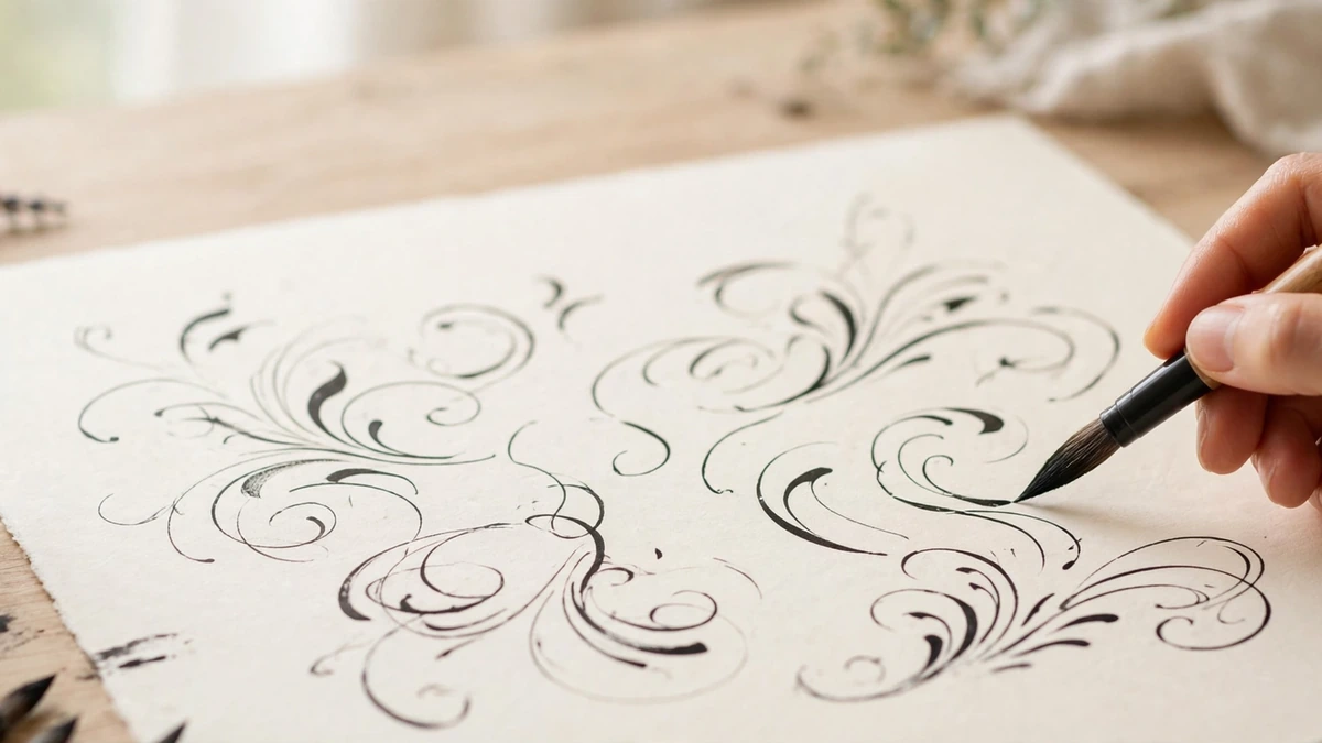
There is a reason calligraphy videos rack up millions of views: watching a skilled hand pull a perfect thick-and-thin stroke feels like magic. The good news is that it is not magic — it is mechanics. Calligraphy for beginners comes down to understanding pressure, angle, and rhythm, and anyone willing to practice basic strokes for a few weeks can produce lettering beautiful enough for wedding invitations, wall art, and handmade cards. This guide walks you through the tools, the foundational strokes, the alphabet, and the practice routine that turns shaky first attempts into confident, flowing script.
Calligraphy for Beginners: What It Actually Is (and Isn’t)
Calligraphy is the art of beautiful writing — but “beautiful writing” covers several distinct disciplines. Pointed-pen calligraphy (Copperplate, Spencerian) uses a flexible nib that spreads under pressure, creating the dramatic thick downstrokes and hairline upstrokes of formal script. Broad-edge calligraphy (Italic, Blackletter, Uncial) uses a flat nib held at a fixed angle, producing letters with built-in contrast from the nib’s geometry. Brush calligraphy uses brush pens or paintbrushes and is the most beginner-friendly entry point, requiring the least specialized equipment.
What calligraphy is not: fancy handwriting. Everyday cursive connects letters quickly for speed; calligraphy constructs each letter deliberately for beauty, with consistent slant, spacing, and stroke contrast. The mindset shift from writing to drawing letters is the real beginner’s leap.
Your Starter Kit: Tools That Make Learning Easier
Start with brush pens — specifically dual-tip brush pens with flexible nylon tips. They need no ink bottles, no nib assembly, and no cleanup, so you can practice anywhere. A set of small and large brush pens in black plus a few colors costs little and covers months of learning. As skills grow, many calligraphers graduate to pointed-pen holders, flexible nibs, and bottled sumi or walnut ink for the crispest hairlines.
Paper matters enormously and is where beginners waste the most money on the wrong supplies. Use smooth, bleed-proof paper: laser printer paper, Rhodia pads, or HP Premium 32 lb paper. Rough or fibrous paper catches flexible nibs, causing splattering and frayed tips — the dreaded “railroading” that makes beginners think they lack talent when they only lack smooth paper. Avoid standard copy paper for pointed pen; its fibers snag nibs mercilessly. Choosing surfaces deliberately is a universal art skill — the same care that goes into selecting colored paper for professional projects applies to picking calligraphy paper.
Add a pencil and ruler for guidelines, a light pad or window for tracing practice sheets, and printed exemplar sheets of your chosen script. Free Copperplate and brush-lettering practice sheets from reputable calligraphy educators give you accurate letterforms to trace — tracing is not cheating at this stage; it is how your hand learns the shapes.
The 8 Basic Strokes: Your First Two Weeks
Every letter in pointed-pen and brush calligraphy decomposes into eight basic strokes. Master these before touching the alphabet, and letters will assemble themselves.
1. The upstroke: a hairline curve from bottom-left to top-right, drawn with zero pressure. Light, quick, confident.
2. The downstroke: a straight line from top to bottom with full pressure, creating the thick shade. This pressure contrast is the heartbeat of calligraphy.
3. The overturn: an upstroke that curves over and descends — the top of letters like h and m.
4. The underturn: a downstroke that curves at the bottom into an upstroke — the base of u, i, and w.
5. The compound curve: an underturn flowing directly into an overturn, the wave at the heart of flowing script.
6. The oval: a slanted ellipse drawn with light pressure on the upstroke side and shade on the downstroke side — the body of o, a, and d.
7. The ascending loop: the tall stroke of l, h, and b, looping with an even, narrow shape.
8. The descending loop: the tail of g, y, and j, mirroring the ascending loop below the baseline.
Practice each stroke in rows across the page, slowly and deliberately, until your hand produces them without conscious thought. Two focused weeks on strokes saves two frustrated months on letters. This is the same foundational discipline behind musical precision — our sheet music guide explores how another notation art rewards patient drill.
Learning the Alphabet: Minuscules First
Start with lowercase letters (minuscules), grouped by stroke family rather than alphabetical order. Group one — i, u, w, t — uses only upstrokes, downstrokes, and underturns. Group two — n, m, x, v — adds overturns and compound curves. Group three — o, a, d, g, q — introduces ovals. Group four — l, h, b, k, j, y, z — covers loops and the trickier forms. Master one group fully before moving to the next; rushing the alphabet is the classic beginner error.
Three rules govern beautiful letters. Consistent slant: most scripts slant 52–55 degrees from the baseline; draw slant lines on your guideline sheets and check every stroke against them. Consistent x-height: the body of every lowercase letter occupies the same vertical space — wobbly x-heights scream “beginner” louder than any shaky stroke. Even spacing: the white space between letters should feel rhythmic and uniform; beginners consistently space too tightly. The design principles are identical to typography fundamentals — see our graphic design tips for beginners for how professionals think about letterforms and space.
Capital letters (majuscules) come after minuscules are comfortable. They are more decorative, less standardized, and far more forgiving — capitals are where your personal style begins to emerge. Flourishing (decorative loops and swashes) comes last of all; premature flourishing is like garnishing a dish you have not cooked yet.
Connecting Letters into Words
Beautiful isolated letters do not automatically make beautiful words. The transition skill is the exit stroke: every minuscule ends with a tiny upstroke flick that becomes the connector to the next letter. Keep connectors light and quick — they are bridges, not features.
Practice with pangrams and common words before attempting names or quotes. Write “minimum” repeatedly: it contains only basic strokes and reveals spacing inconsistencies instantly. Then move to your own name, then short phrases. Photograph your practice pages weekly; the month-over-month improvement is dramatic and deeply motivating. When your words start looking gift-worthy, consider the presentation — our engagement photoshoot trends coverage shows how romantic styling and photography elevate handmade paper goods.
5 Beginner Projects That Build Real Skill
1. Place cards
Single names on folded cardstock — the traditional calligrapher’s first paid gig. They teach centering, consistent sizing, and working on final surfaces where mistakes show.
2. Envelope addressing
Wedding and holiday envelopes are where most American calligraphers earn their first income. Practice the recipient’s name five times on scrap before committing to the envelope.
3. Framed quotes
A favorite quote in your best script, framed simply, makes stunning wall art. Style it with the ideas in our bedroom wall art ideas for a cohesive handmade gallery wall.
4. Gift tags and cards
Hand-lettered tags transform ordinary gifts. This low-stakes project builds speed and confidence on small formats.
5. Digitized designs
Scan your best lettering, clean it up in a free editor, and create print-on-demand products. The bridge from hand lettering to digital products is shorter than ever — our guide to starting digital art in 2026 covers the scanning and cleanup workflow, and Procreate is excellent for refining lettering digitally.
Fixing the 6 Most Common Beginner Problems
Shaky strokes: You are drawing too slowly and gripping too hard. Relax your grip, move from the shoulder rather than the fingers, and commit to each stroke at a steady pace. Speed creates smoothness.
Inconsistent thick-thin contrast: Your pressure is not binary enough. Upstrokes should use the nib’s own weight only; downstrokes need deliberate, even pressure. Practice pressure drills: rows of alternating hairlines and shades until the contrast is automatic.
Ink blobbing: Too much ink on the nib or pausing mid-stroke. Dip shallowly, wipe excess on the bottle rim, and never stop in the middle of a shaded downstroke.
Nib catching on paper: Your paper is too rough or your angle is wrong. Switch to smooth practice paper and hold the pen at roughly 45 degrees to the page.
Letters drifting off slant: You stopped using guidelines. Professionals use guidelines for finished work — there is no shame in them at any level. Draw fresh guidelines for every project.
Hand cramping: Death-grip and tension. Shake out your hand every ten minutes, check that your whole arm is relaxed, and keep practice sessions to 30–45 minutes. Like any handcraft, endurance builds gradually — the patient makers in our old-fashioned darning guide would recognize the discipline.
From Hobby to Side Income
Calligraphy has one of the clearest paths from hobby to income in the American craft world. Wedding suites — invitations, envelopes, place cards, signage — form a multi-hundred-dollar-per-event market where hand lettering commands premium prices precisely because it cannot be faked by a font. Build a portfolio on social media with process videos (the algorithm loves satisfying stroke footage), take on small jobs for friends to build testimonials, and price by the piece with rush fees.
Study the masters to raise your ceiling: the Spencerian script born in 19th-century America remains the gold standard of ornamental penmanship, and examining original specimens — whether online or by visiting an art exhibition — teaches lessons no exemplar sheet can. For a sense of where hand lettering sits in today’s visual culture, our modern abstract art trends coverage shows how contemporary artists blend traditional craft with modern expression.
Calligraphy for beginners is ultimately a practice of attention: pressure, angle, rhythm, repeated until the hand knows what the eye wants. Your first strokes will wobble, your first alphabet will sprawl, and your fiftieth practice page will look like a different person’s work. That transformation — from shaky to flowing, from writing to drawing letters — is one of the most satisfying journeys in all of art. Pick up the pen, draw your guidelines, and make your first hairline upstroke today.